
I don’t like pink. I look at the color and my teeth ache. It’s usually too ‘foo-foo’. Too ‘girly-girly’.
And I don’t think I’ve ever painted anything pink – until now…
Enter the magnificient Art Deco Chifferobe.

I found it on Craigslist. And I almost didn’t buy it (story of my life). It was waaay bigger than I had imagined. And I wasn’t looking for a big piece to refinish.
But
I had to buy it (even though it was located in the basement) and even though, swear to God, I thought the old man was going to have a heart-attack helping me.
Personally, I was two minutes away from having a seizure lifting it up the stairs, and three minutes away from my knees snapping.
But
It came home with me. And it stayed in my garage for months and months. Waiting?
And then one night, sometime between the unGodly hours of 2 a.m. and 5 a.m. The time when I listen to the dulcet tones of my husband sleeping
Peacefully, and deeply.
The time when he’s resting, regenerating….the time when I want to put a pillow over his face…and feel completely justified for doing so.
That’s the time when I suddenly realized….Pink! The chifferobe needs to be Pink (and I hate pink) and gold leaf. Of course!!
And then everything just fell into place when I found this pink from Pure & Original.
 It’s a beautiful pink. Not ‘foo-foo’, not too girly. A little on the mauve side, very muted.
And when you pair it with gold leaf. Boom!
Absolutely Fabulous, darling.
When I gold leaf pieces I usually always use a red bole (fancy word for base color). If you use red (the traditional color) it gives the gold leaf a nice warm glow. If you use a black bole, the gold leaf takes on a cooler appearance.
I technically could have used either, but I am a tad partial to a red bole.
 I picked a color called ‘Lipstick’ (if only for the name). How can you go wrong with Lipstick?
You can’t. It’s an impossibility.
And because I knew I wanted to work with lots of color variance on the chifferobe, I added Pure & Original Neutral Ground to the mix. I’ve used this color before, on The Door Named Pearl

I prefer to blend my paints when I paint a piece. I think it adds more interest to work with thin layers, rather than a solid color.
It takes more time, sure – but it’s worth it (said the Actress to the Bishop).
And this is what I ended up with.
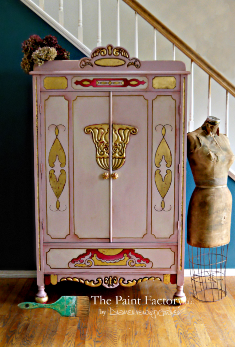
Total Art Deco Glam.
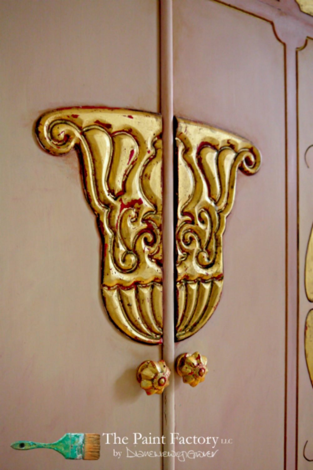
If you look closely, you can see the Lipstick underneath the gold leaf.
To mute the gold leaf, I sealed it with Pure & Original Eco Dead Flat sealer (awesome product).
I love gold, but don’t like ‘shiny-shiny’. The Dead Flat sealer takes away some of the ‘bling factor’ in a good way.
Here you can see the different layers of paint. The panels are a mix of Old Rose and Neutral Ground.

While the main body is Old Rose. To add shading, I mixed the paint colors together. Lots and lots of thin layers.
And then did some shading with General Finishes Burnt Umber glaze.
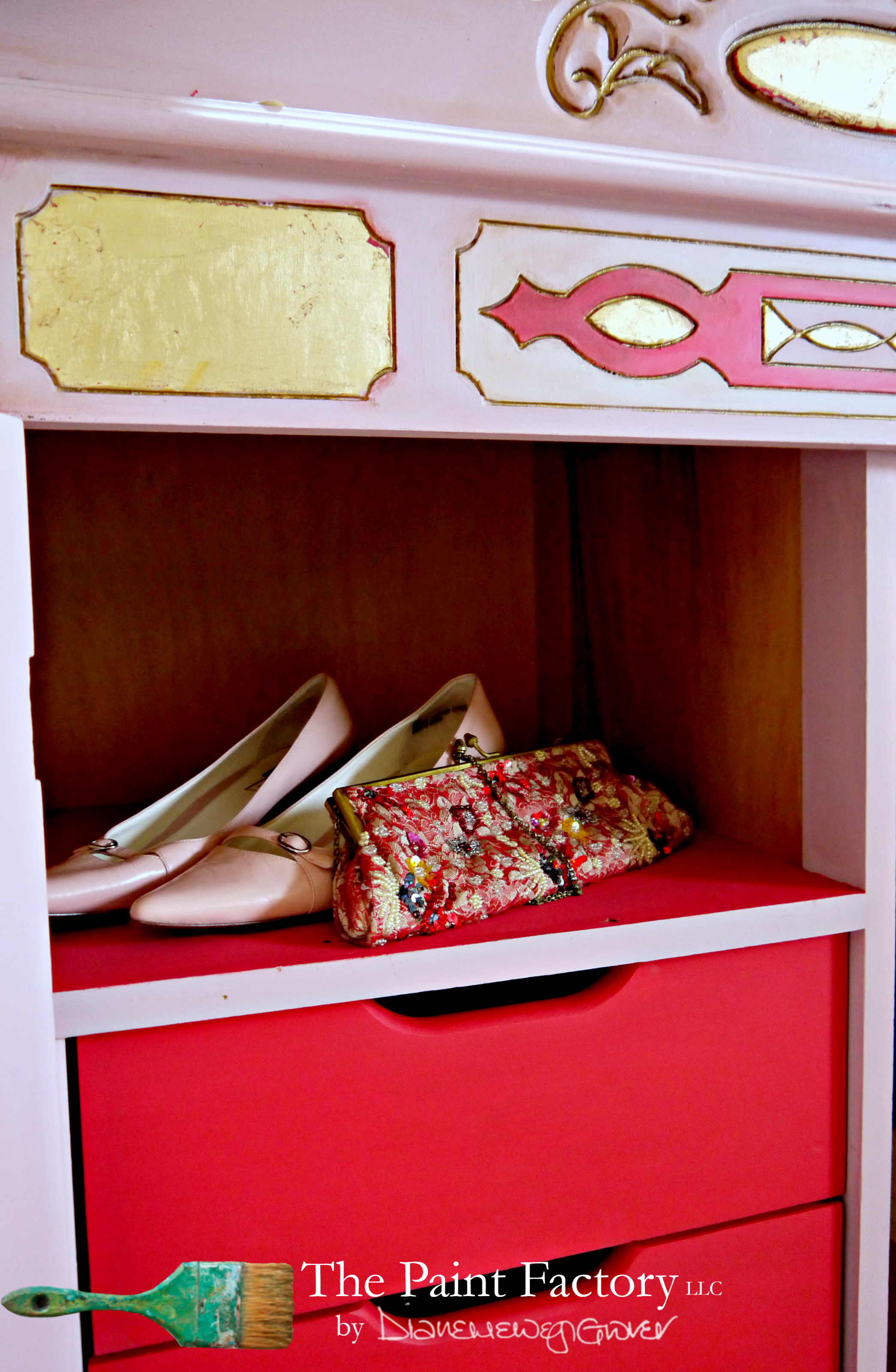
For the inside I went with Lipstick. Why not, a girl needs her lippy!
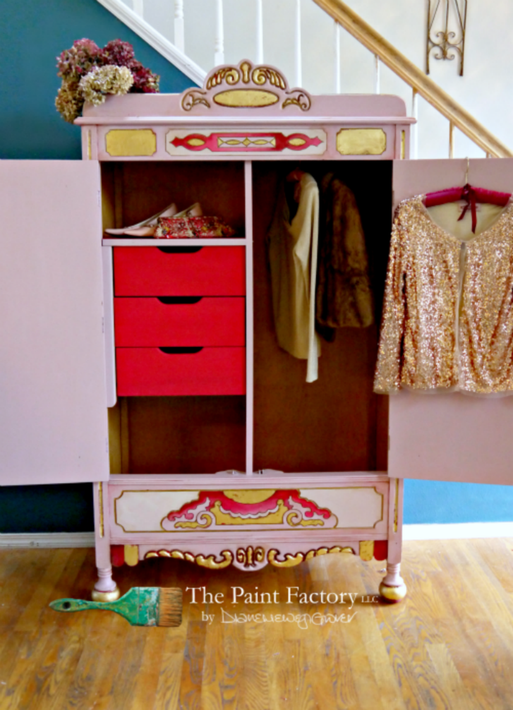
The funny thing about the photo above is that I rummaged through my closet to find items to display.
It turns out that, at some point in my life, I purchased a pair of pink shoes?

(sometimes I don’t even recognize myself, for cripes sake).
I don’t like pink. They remain unworn.
And the gold sequined jacket? I also discovered that I own five FIVE gold sequined tops.
Naturally I blame a deep rooted (yet to be fulfilled) desire to be on Dancing With The Stars??
The lesson learned duing this project is that there comes a time when I need to step back and allow myself to ‘re-see‘ colors.
It’s no secret that I hate the color wheel. I think it a stupid contraption and incredibly confusing.
And what I absolutely hate most about it is someone/something telling me what colors should go together. I don’t work like that. I have favorite colors, and there’s certain color palettes that I tend to work with more than others.
And then there’s the colors that I hate dislike.
Pink.
But – depending on the piece of furniture and the pairing of certain colors

Colors (and attitudes) have the potential for change.
And if anyone knows me, you know that I am a prime candidate for a good attitude adjustment!
{insert catchy ending phrase here}
Diane aka The Paint Factory
Possibly the world’s most annoying song?
so, so, so, so beautiful, Diane. Inspiring. For real. love reading about your process, inner and outer.
I’m hardly on your level, Blake!
It’s fantastic. I’ve watched your teaser photos and I’m thrilled to see the interior as well as that fabulous exterior. Lipstick — of course. Perfect. I appreciate the lessons learned: don’t rush things, inspiration takes time, and let your artistic muse lead you where you need to be.
Perfect for Beauty and the Beast! I do like pink but it’s hardly ever part of my daily life. And I too am awake in the wee hours listening to snoring. It’s called “sentinel sleep,” quite normal but very annoying.